Notification Settings Revamp
The organization embarked on a comprehensive transformation of its notification settings experience, focusing on enhancing usability, accessibility, and consistency across platforms.
The existing system was hindered by outdated technology, fragmented design, and a complex user flow, resulting in inefficiencies and frustration for millions of users.
As a lead product designer, I played a pivotal role in this initiative, collaborating with stakeholders, developers, content strategists, and accessibility experts to design an intuitive, scalable, and compliant solution.
The Challenge
The existing notification management experience had several critical issues:
Outdated & Inconsistent UI: Disjointed visual styles and interaction patterns created confusion.
Poor Navigation & Usability: Users struggled to locate and adjust their notification preferences.
Accessibility Gaps: The system did not fully adhere to WCAG guidelines, making it less inclusive.
Business & Compliance Constraints: The solution needed to balance user needs with internal policies and regulatory requirements.
The Solution
Optimized Notification Management Menu
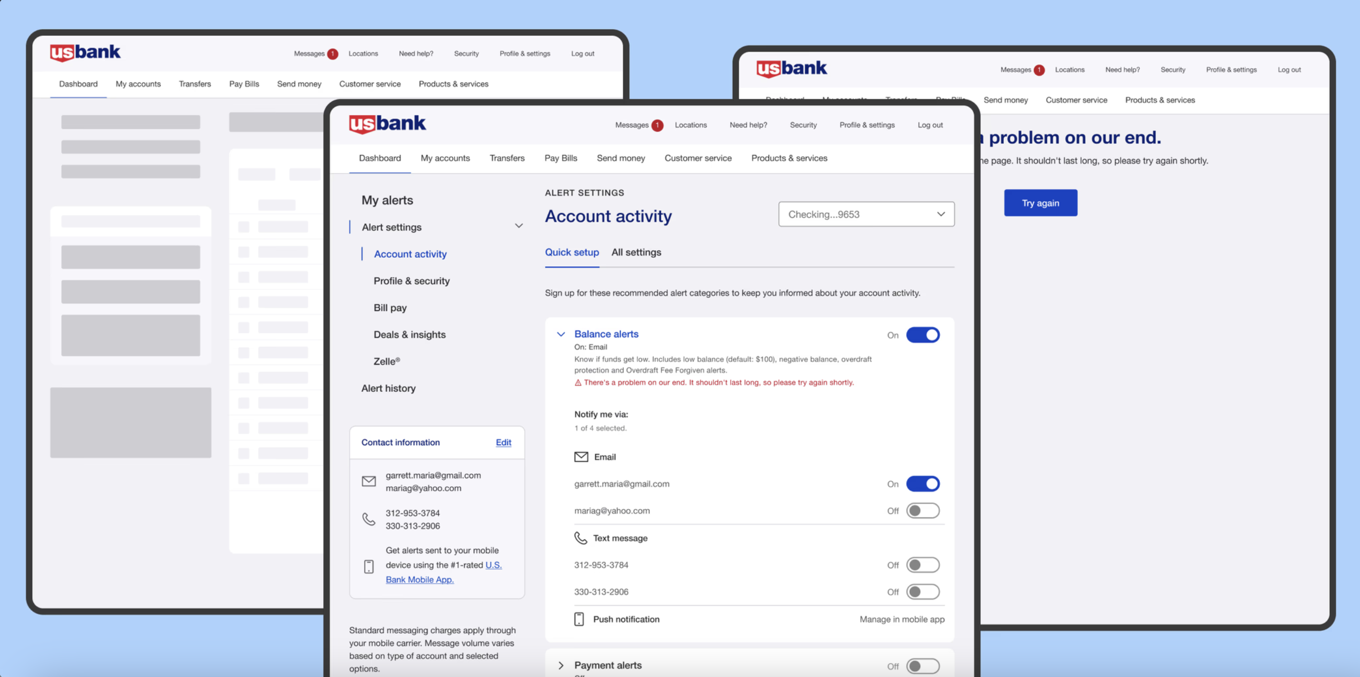
We set out to simplify the complex notification management menu, which contained multiple sub-menus across web and mobile platforms. To better understand user mental models and identify pain points, we conducted a comprehensive study leveraging competitive analysis, open-card sorting, and closed-card sorting. This research informed the creation of a streamlined, standardized menu, ensuring a more intuitive and consistent experience across all digital platforms.
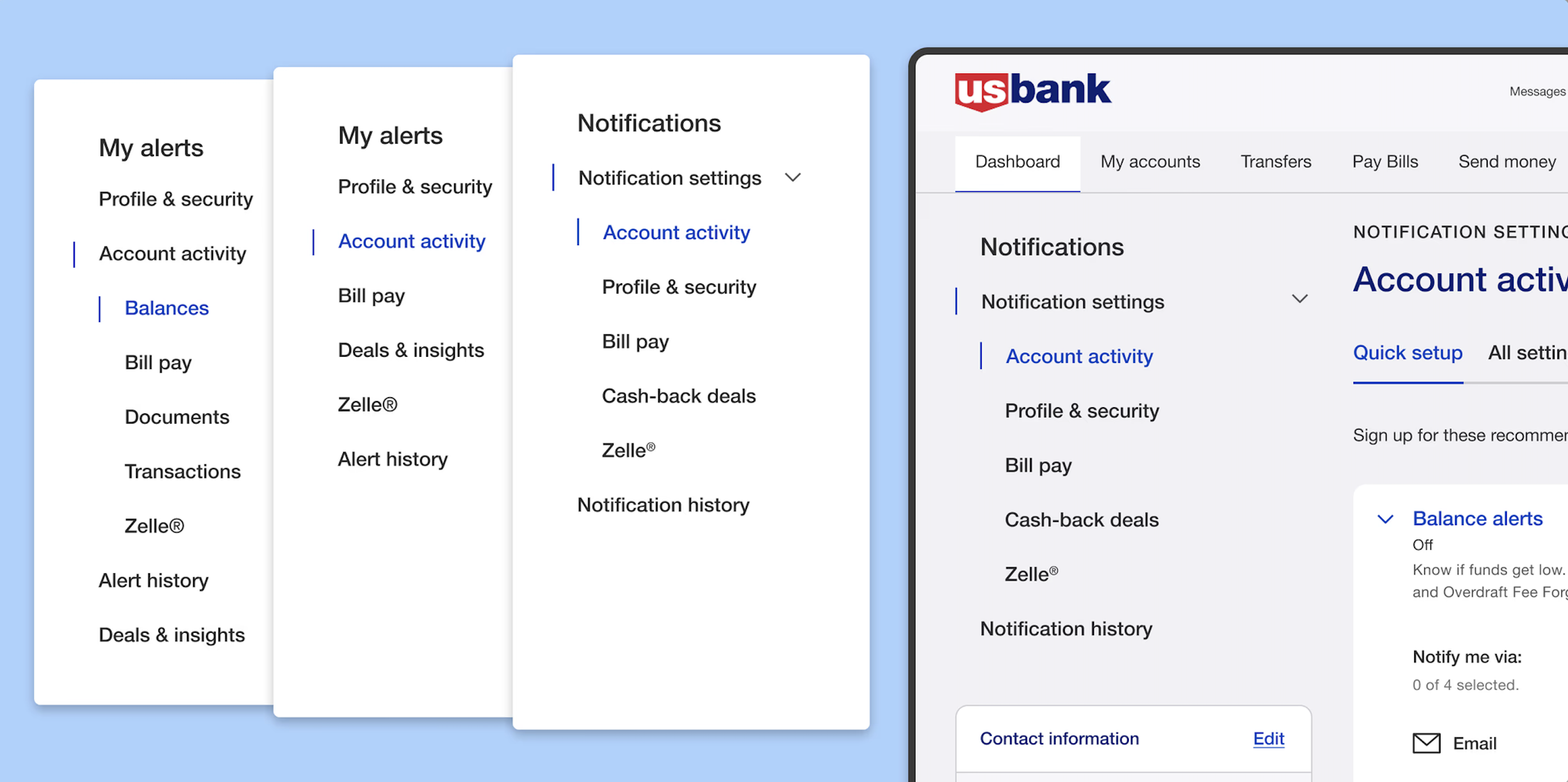
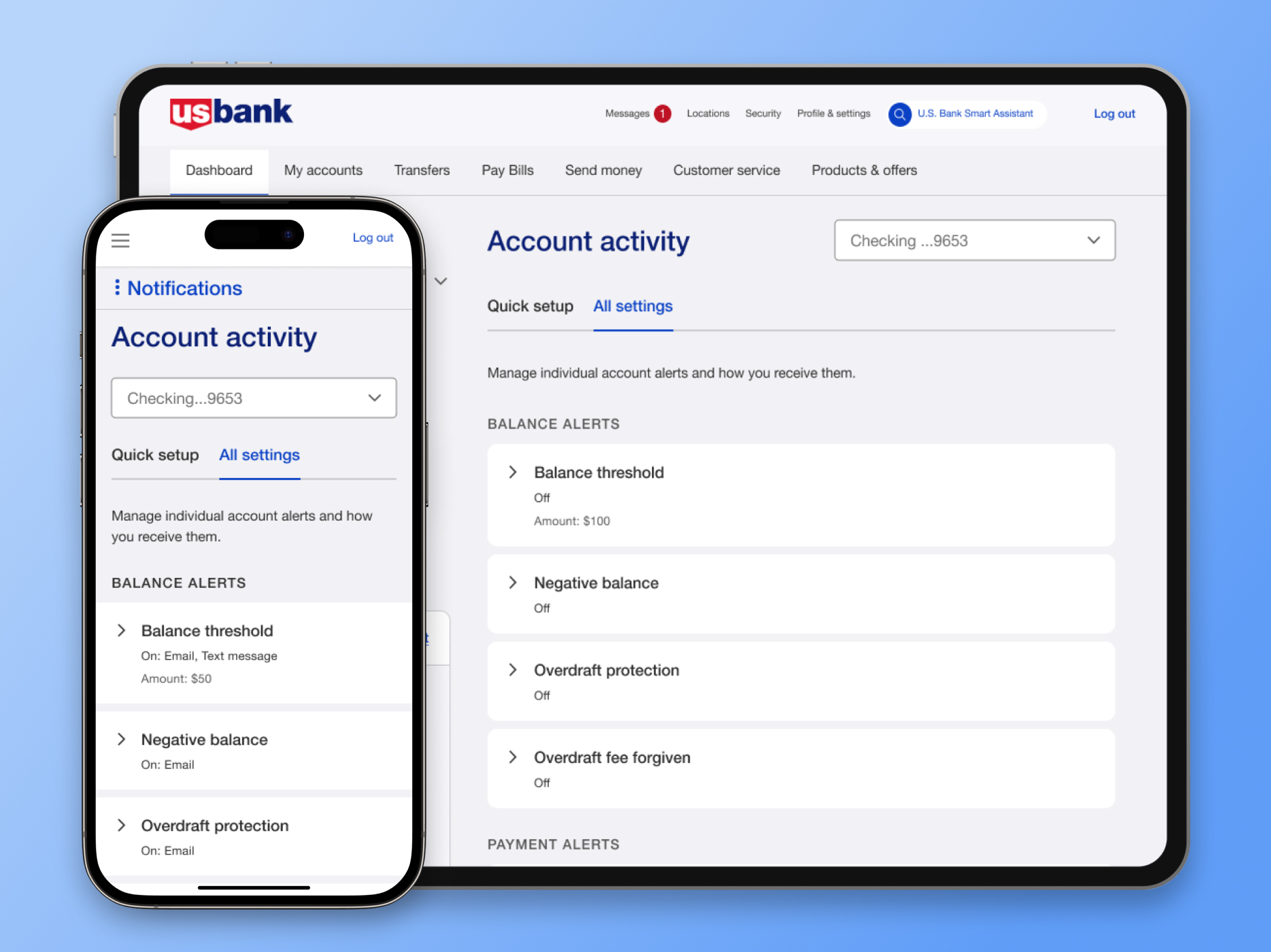
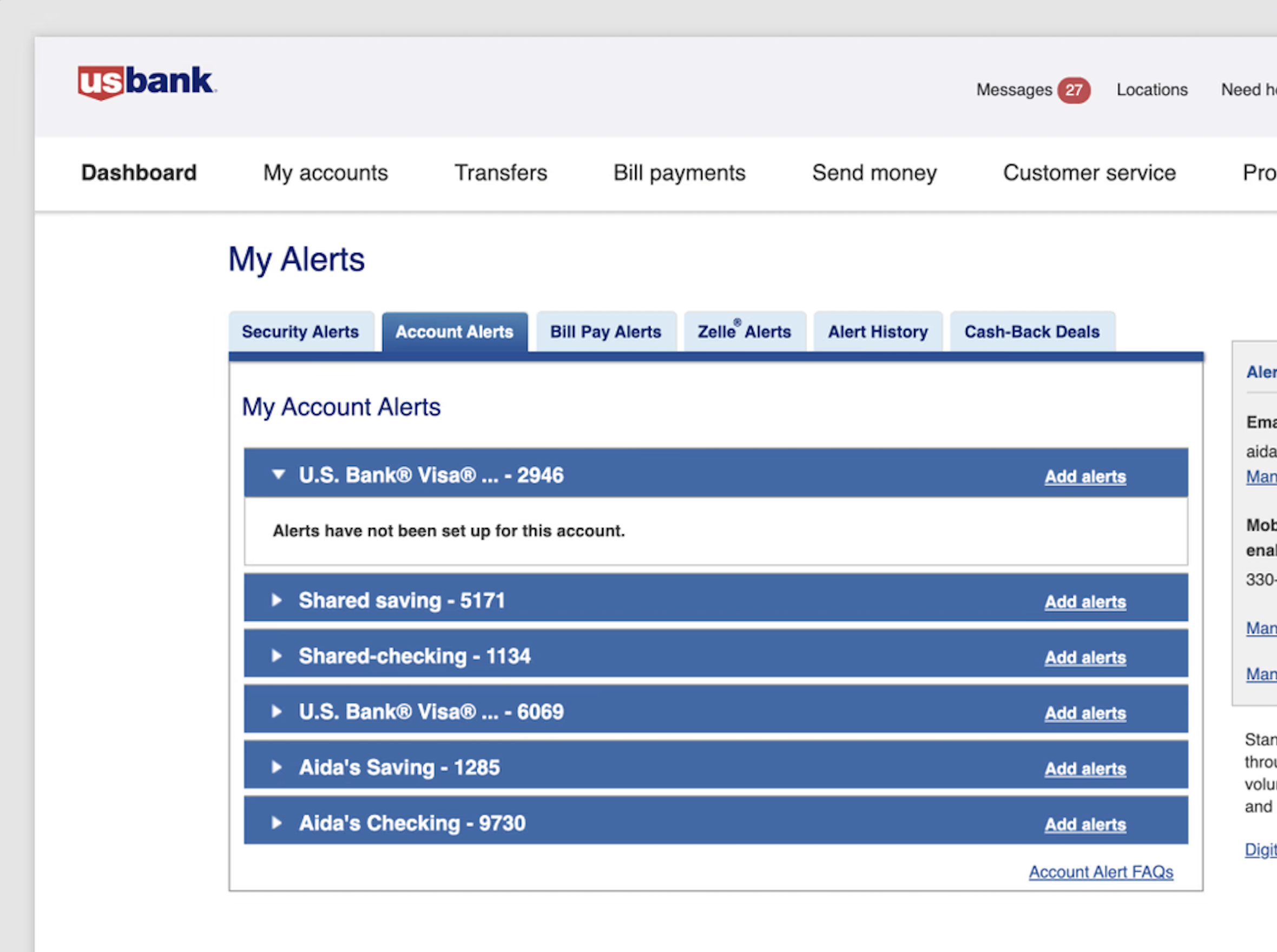
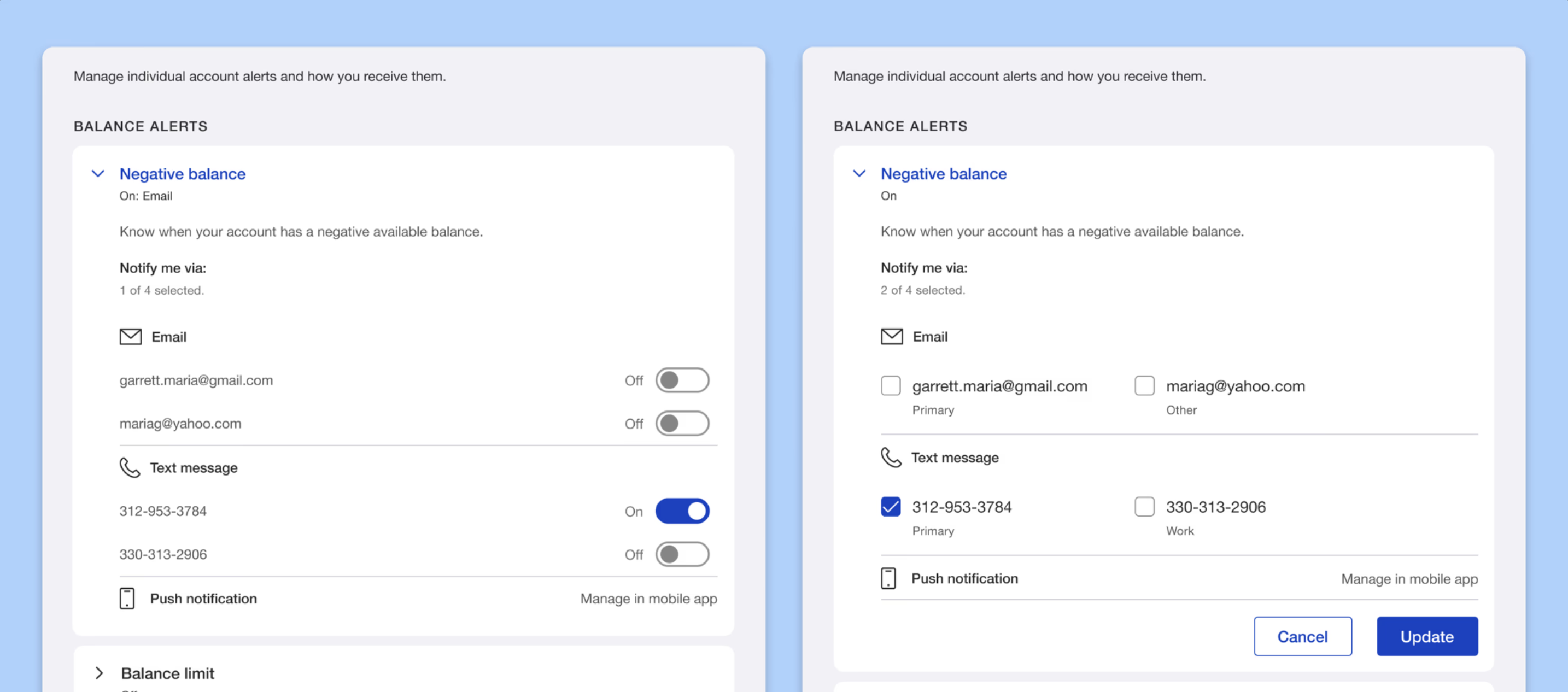
The “Account Activity” notification posed significant complexity due to its numerous subcategories and diverse account types. Usability challenges, identified in the 2021 Corporate Insight Report, included restricted navigation, single-section expansion, and a step-by-step enrollment process that required users to navigate between multiple pages. To address these issues, I redesigned the notification management system into a seamless, single-page experience, allowing users to manage, edit, and enroll in notifications without leaving the screen.
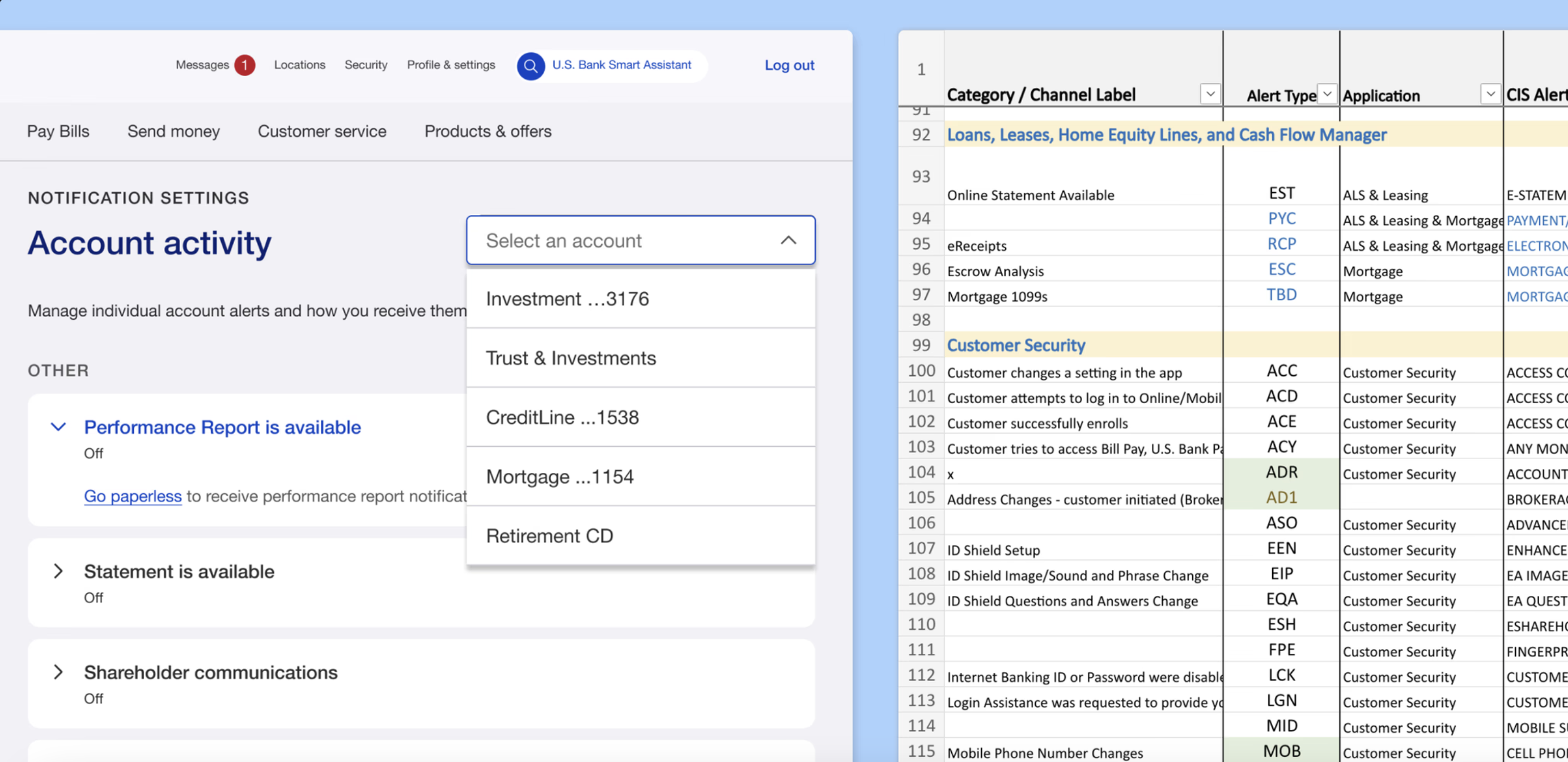
Due to time and resource constraints, we prioritized popular account types, including savings, checking, and credit cards. While some users were given priority, our primary goal was to effectively serve the majority. We then developed a comprehensive notification inventory, covering various account types and their associated notifications, such as Investments, Trust & Investment, Lines of Credit, and Corporate Cards.
Redesigning account activity proved to be the most challenging aspect. With subcategories differing across account types, we needed an extensive inventory for notification management that accounted for all account types and notification categories.
Integrating modern design trends into traditional banking posed a challenge, especially when choosing between conventional checkboxes and toggle buttons. After discussions with the team and stakeholders, the toggle button was selected as the better option due to its alignment with our mobile app, reduction of extra clicks, and more streamlined user interaction.
Advocating for this change faced resistance, primarily due to concerns about web usability and accessibility. However, after design reviews and extensive testing, we proceeded with the implementation.
User research key findings
Three rounds of unmoderated usability testing involving over 150 users revealed the following insights:
Ease of Use: Toggles outperformed checkboxes, offering a more intuitive interaction.
User Control: Users expressed a stronger sense of control when using toggles.
User Confidence: While toggles were favored, users indicated a preference for receiving a confirmation message to reinforce their actions.
Ultimately, the implementation of the toggle button not only enhanced efficiency but also significantly improved the overall user experience.
Expanding the experience across partner card
We partnered with various card providers to create a notification management system that served as a foundational resource, driving redesigns across their platforms as well. Through cross-team collaboration, our team led this initiative, working closely with stakeholders to ensure that partners could seamlessly launch their updated notification management designs. The result was a cohesive and unified notification management experience across all platforms and their associated products.

In addition to redesigning and enhancing the existing notification management system, I introduced significant user experience improvements, including optimized error handling and the implementation of skeleton loaders to manage API wait times. These enhancements ensured a smoother, more responsive user experience. We also prioritized accessibility, ensuring the design was inclusive and fully adhered to A11Y standards. Through cross-team collaboration, we expanded the platform to integrate with partner card systems, maintaining consistency and accessibility, which allowed us to scale the solution effectively across multiple platforms.
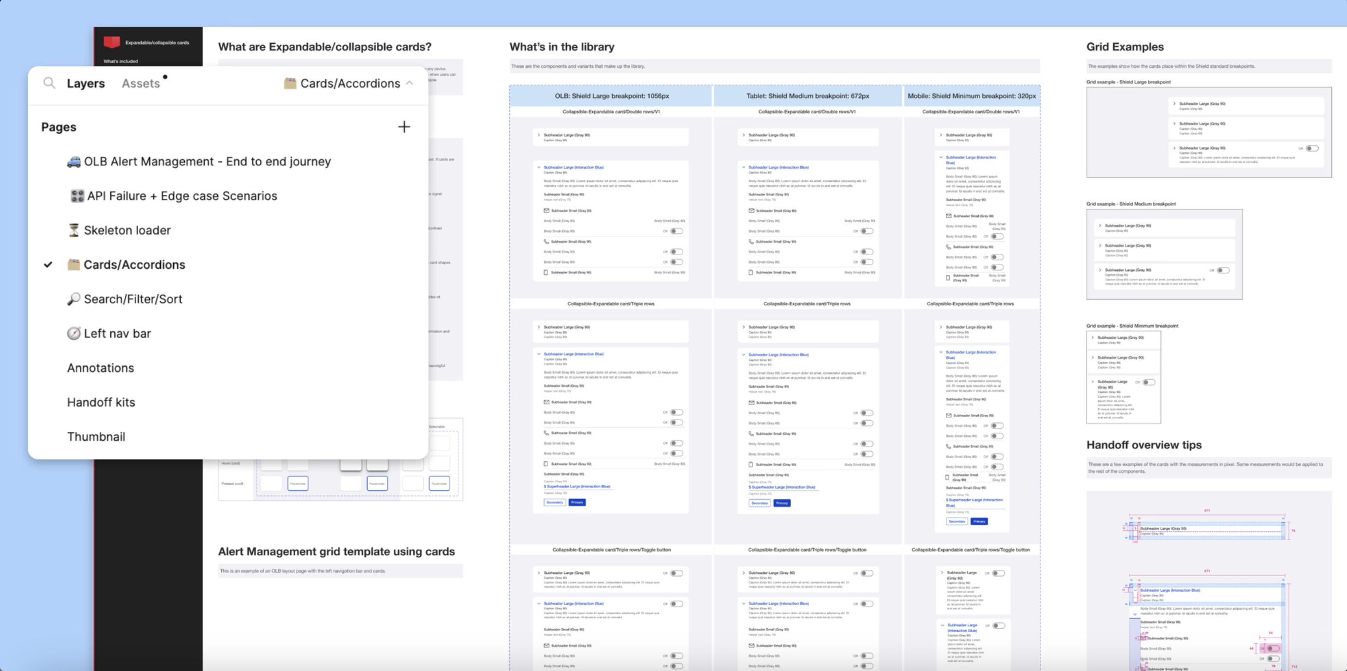
We pioneered the introduction of the toggle button on our web platform, integrating it with collapsible-expandable cards to create a consistent and efficient notification management system. As teams across the organization adopted our solution, I developed a centralized component library for notifications and notifications, ensuring design consistency across platforms. To bridge the gap between design and development, I created a comprehensive Figma flow and curated a design library containing components, patterns, and accessibility guidelines, enabling all teams to align with the solution effectively.
The Outcome
The Positive User Feedback
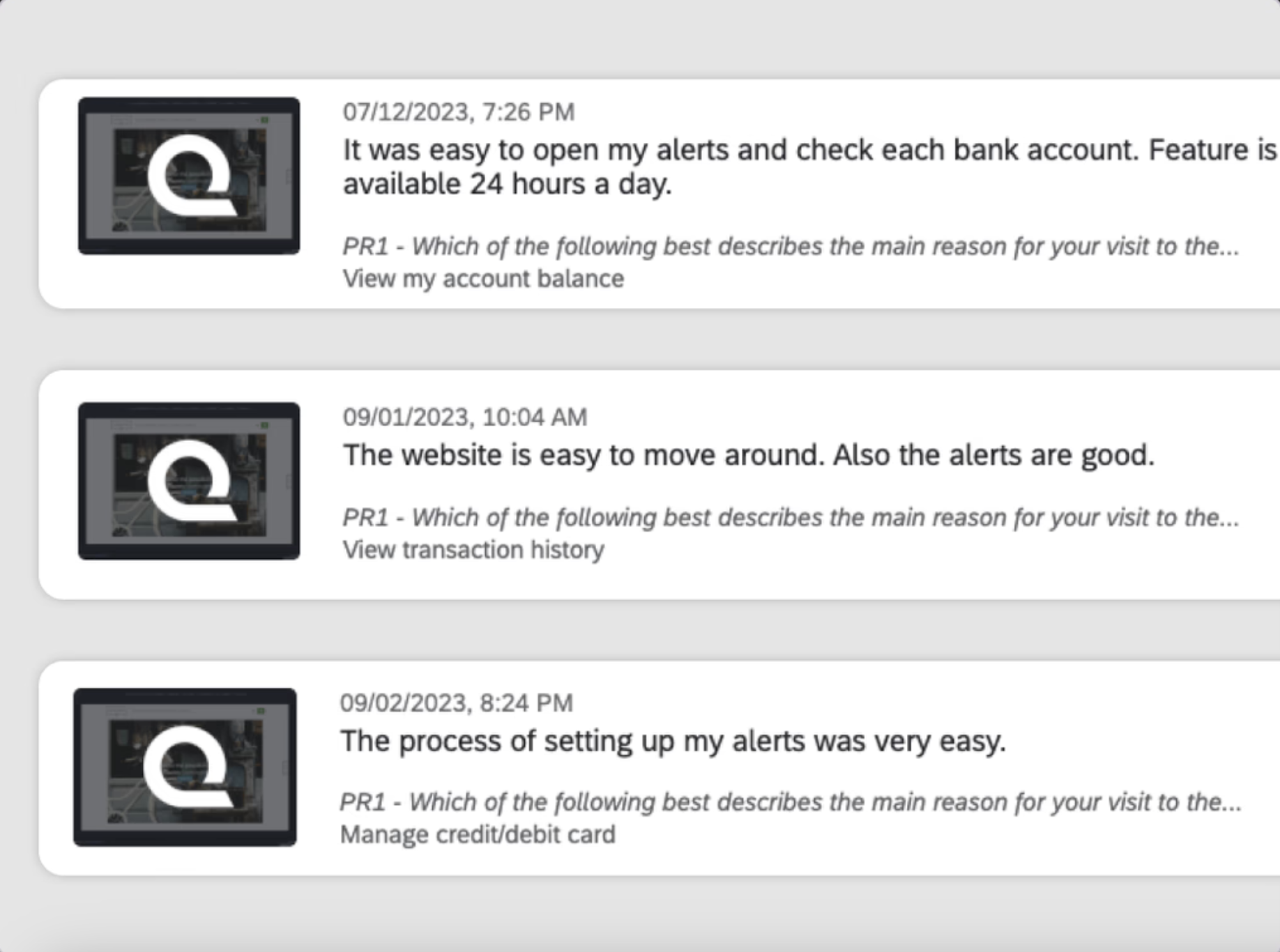
We received overwhelmingly positive feedback from a qualitative survey on online banking notification management following the launch of the initial MVP. It was a great success for our team to see users easily achieve their goals through the redesigned platform, validating the effectiveness of our efforts.
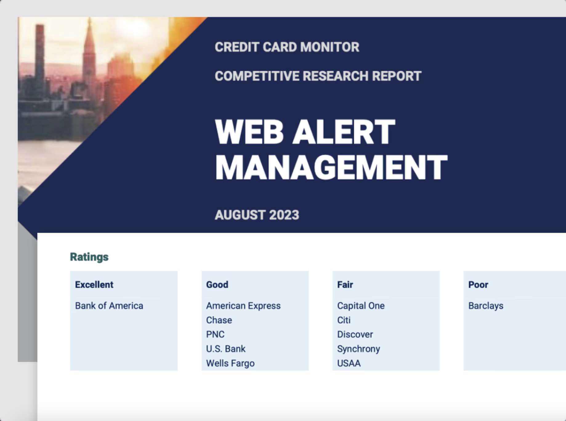
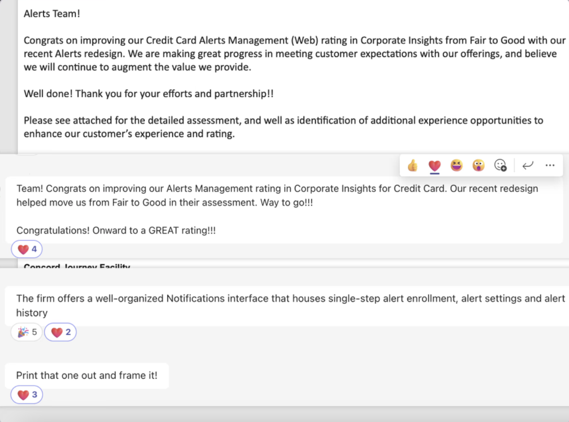
The Corporate Insight Rating Changed From Fair Rating To Good
With the new notification management released, we earned recognition from the prominent Corporate Insights Report on improving the Credit card notification management (Online Banking) rating from Fair to Good with our recent notification redesign and enhancements.
Exceeding Business Objective
The launch of the new notification management system led to recognition in the esteemed Corporate Insights Report, where we successfully improved the credit card notification management rating in online banking, raising it from “Fair” to “Good” through our recent redesign and enhancements.
Reflections
Want the inside scoop?
Curious about the process and challenges behind this project?
I’d be happy to share more, feel free to connect!