In-App Notification Center
Creating a brand-new in-app notification center for the U.S. Bank native app was an exciting challenge that required a user-first approach and cross-functional collaboration. The goal was to provide users with a secure, organized, and intuitive hub where they could easily access and manage their important account updates and notifications in one place.
This meant designing a seamless experience with bulk actions, notification filtering, and detailed notification pages—all while ensuring consistency with the bank’s online platform. From research to final implementation, every decision was made to enhance usability, accessibility, and engagement, making it easier than ever for users to stay informed and in control. Let’s walk through how this product came to life.
The Challenge
We started with a fundamental question: How do users currently manage their bank notifications, and how can we make this experience better? Many banking apps scatter notifications across emails, push notifications, and inboxes hidden deep within the app. That’s not ideal—especially for critical alerts about transactions, security updates, or personalized offers.
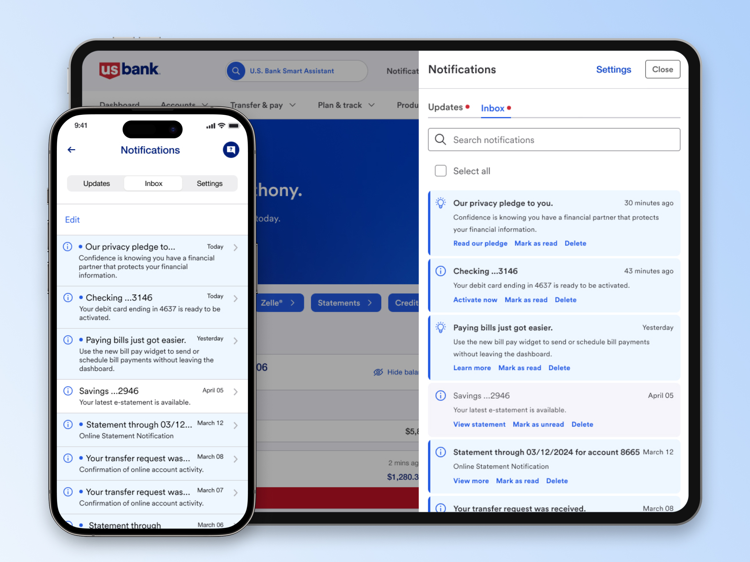
So, we set out to design a centralized notification center that brings everything together in one place. Users should be able to quickly scan their notifications, take action when needed, and feel confident they’re staying on top of their finances. To ensure a seamless experience, we aligned this with the Notification Center on Online Banking, creating parity between the two platforms. This consistency means users can access and manage their notifications effortlessly, whether they’re on desktop or mobile, without missing important updates.
The Solution
Once we had a clear understanding of the problem, we honed in on what this notification center needed to deliver. First and foremost, it had to be clean and organized, allowing users to quickly scan their notification and spot what’s new at a glance. Nobody wants to dig through the clutter just to find an important update.
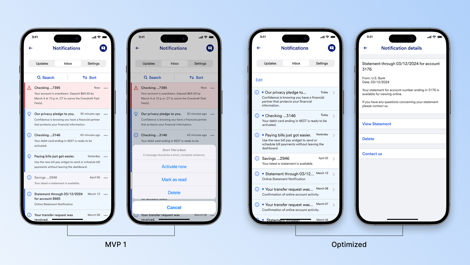
Bulk actions were another must-have. Managing notifications one by one can be frustrating, so we made it easy to mark all as read or delete multiple notifications at once—a simple yet powerful way to keep things under control.
For deeper engagement, we built a detailed notification view, where users could see full content and take action, whether that meant responding to a secure notification or reviewing a flagged transaction. And, of course, security was a top priority. Since these notification contain sensitive financial information, we ensured robust encryption and user authentication were in place to keep accounts protected.
We also explored advanced features like notification filtering and smart categorization, but for the first release, we focused on nailing the essentials—delivering a seamless, intuitive, and secure notification experience.
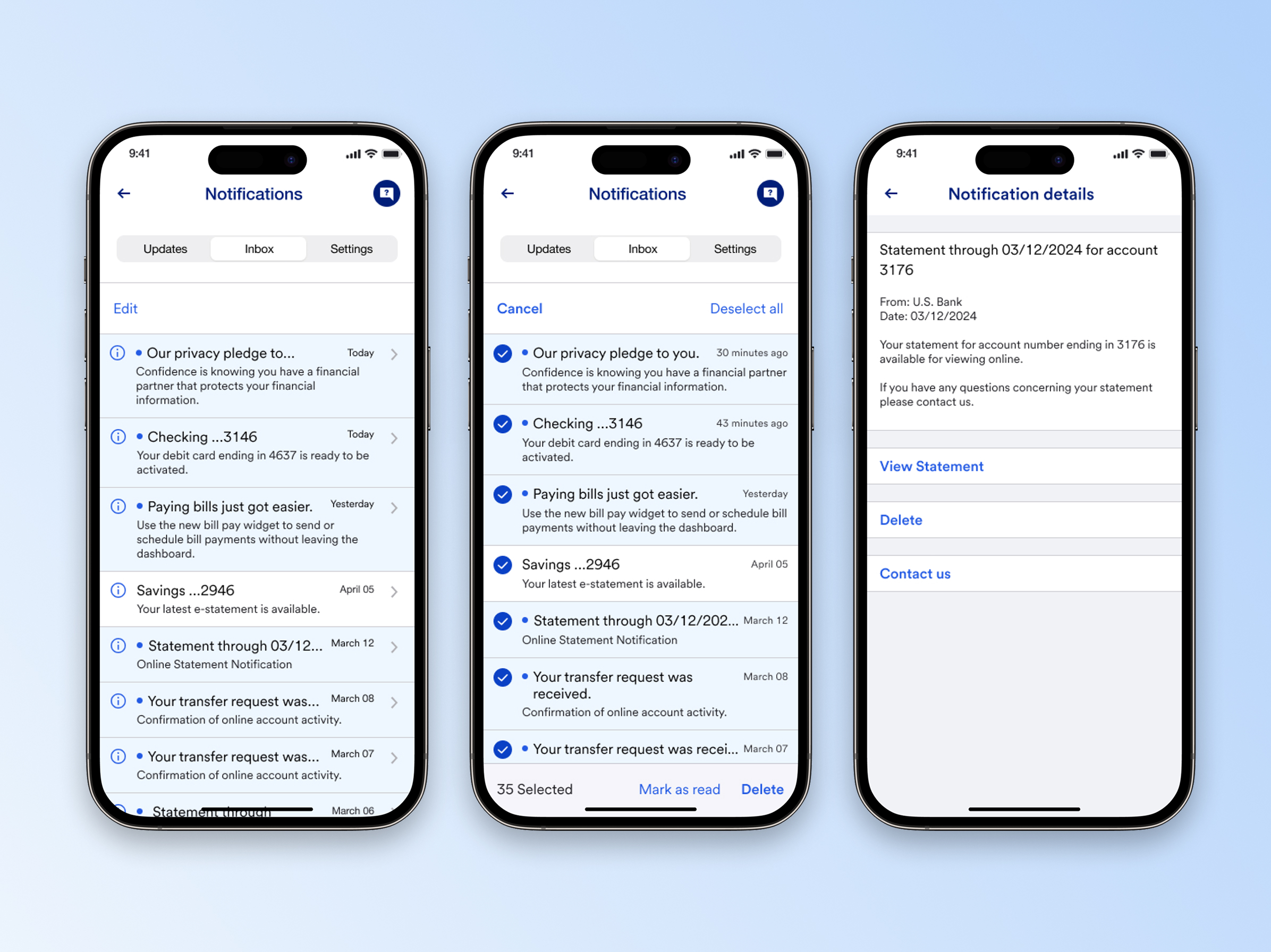
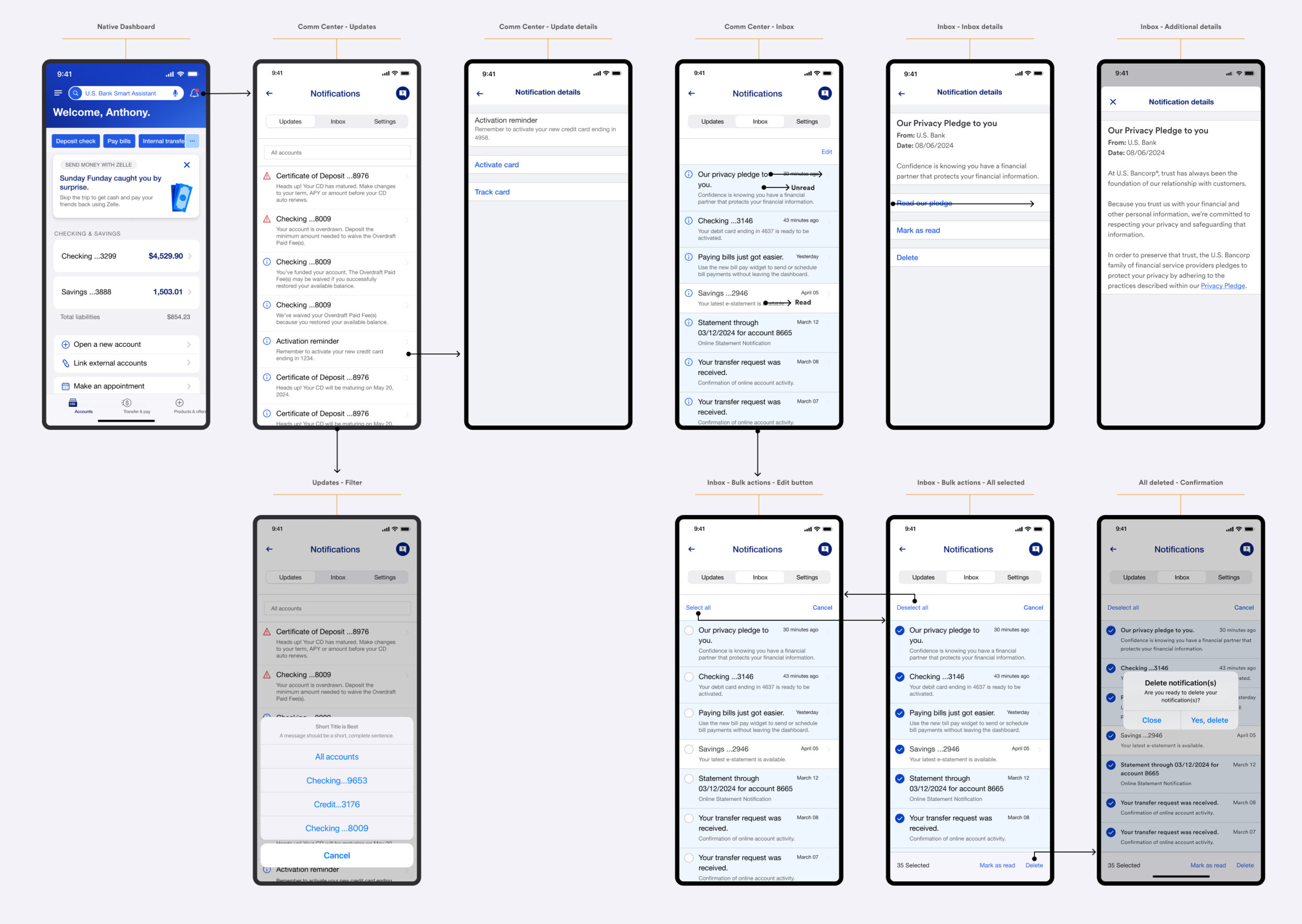
Next, we stepped into the user’s shoes—how would they interact with the notification center from the moment they opened it? First, finding it had to be effortless. We made sure it was easily accessible from the app’s main navigation by placing a bell icon with a red count indicator, so users never had to dig for their notifications.
Once inside, they land in the inbox view, where all their notifications are neatly organized. Unread notifications stand out, making it easy to spot what’s new. To keep things smooth and intuitive, we introduced edit mode, allowing users to easily select multiple or all notifications and apply bulk actions. This way, they can quickly mark notifications as read, delete them, or take other actions without unnecessary steps.
When a user taps on a notification, they’re taken to the notification detail page, where they can see the full content. If they need to take action—whether it’s confirming a transaction or responding to customer support—clear buttons guide them seamlessly.
We also considered the edge cases. What happens when someone has hundreds of notifications? What if they accidentally delete something important? These questions helped us refine the experience, ensuring it was both efficient and forgiving for users managing their notifications.
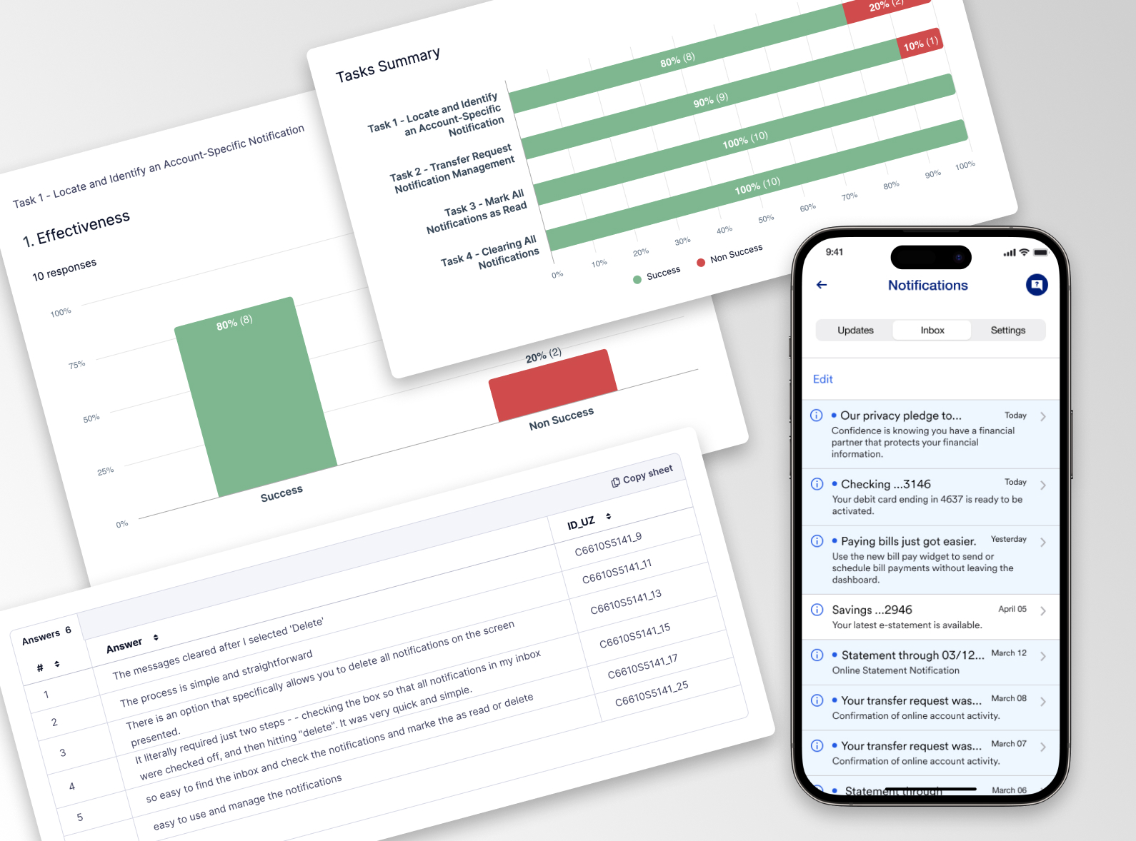
To evaluate the effectiveness, clarity, and usability of the new in-app notification center, ensuring it meets user needs and expectations.
- Conducted three rounds of usability testing with a diverse group of U.S. Bank mobile app users.
- Participants were asked to complete key tasks, such as finding notifications, marking them as read, deleting notifications, and taking action on account alerts.
- Tested across different device types to ensure a consistent experience.
User feedback on the new in-app notification center was overwhelmingly positive. Most (80%) easily found it via the main navigation, though some expected access from the homepage—a future consideration. The bulk action feature was a hit, with 90% quickly managing notifications, mark as read or delete notifications. Opening notifications was smooth for 85% of users, who valued clear action buttons, though some suggested making urgent notifications stand out more, prompting refinements.
The color-coded priority system helped users quickly differentiate notification types, and 94% found text and contrast easy to read. Even users with color blindness could identify alerts without red/green dependency. Overall, 90% felt more in control of their banking updates, appreciating the consistency between mobile and online banking. Many expressed greater confidence, knowing they wouldn’t miss critical updates.
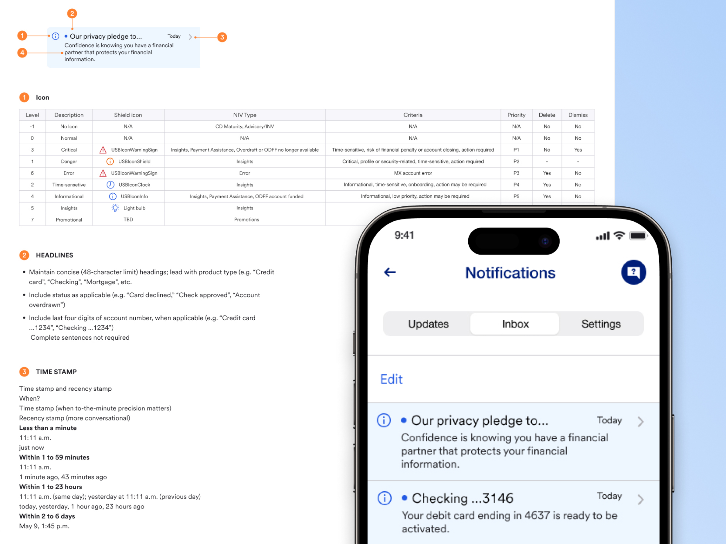
One of the most important steps in this process was creating a set of guidelines and business rules to ensure that all future notifications follow the same structure, tone, and behavior.
We wanted to make sure that every notifications—whether it’s a security alert, a transaction update, or a promotional offer—maintains consistency in how it’s displayed and delivered. To achieve this, we established:
- A standardized notification framework that defines when and how notifications should appear in the notification center.
- Clear content guidelines to ensure that notifications are concise, easy to understand, and actionable.
- Priority levels so critical security alerts always take precedence over general updates.
- Rules for notification expiration and deletion to prevent clutter and keep the inbox manageable.
- User preference controls to allow customers to manage what types of notifications they want to receive.
By setting these standards early, we ensured that future iterations of the notification center would remain user-friendly, scalable, and aligned with US Bank’s communication strategy.
The Outcome
Once the design was locked in, it was time for our developers to bring it to life. The front-end team worked on implementing smooth transitions and animations, while the back-end team handled secure notification storage and real-time syncing with US Bank’s systems.
We also optimized performance so that notifications load instantly—even for users with hundreds of notifications. Security remained a top priority, ensuring encryption and authentication measures were in place to protect sensitive data.
With everything built and tested, we rolled out the notification center to a small group of users first. This allowed us to gather feedback before the full launch. Were users able to find notifications easily? Did bulk actions make their inbox feel more manageable? What could we improve?
Post-launch, we kept a close eye on analytics. Were users engaging with their notifications more efficiently? Were they taking action on important notifications? Based on these insights, we planned future updates—like smarter filtering options and better push notification integration.
Reflections
Looking back, this project was more than just designing a notification center—it was about rethinking how users engage with their banking updates in a way that feels seamless, secure, and intuitive. We balanced functionality with simplicity, ensuring that every interaction—whether it’s marking a notification as read or taking action on a security alert—feels effortless. The process reinforced the importance of user feedback, iterative design, and having strong guidelines to future-proof the experience. As we continue to refine and enhance the system, one thing remains clear: great design isn’t just about what users see—it’s about how it makes them feel in control of their financial world.
Want the inside scoop?
Curious about the process and challenges behind this project?
I’d be happy to share more, feel free to connect!