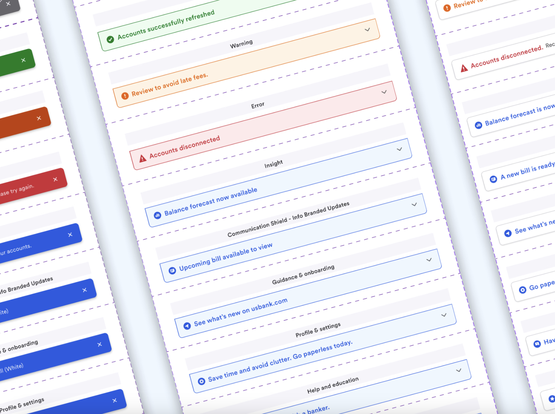
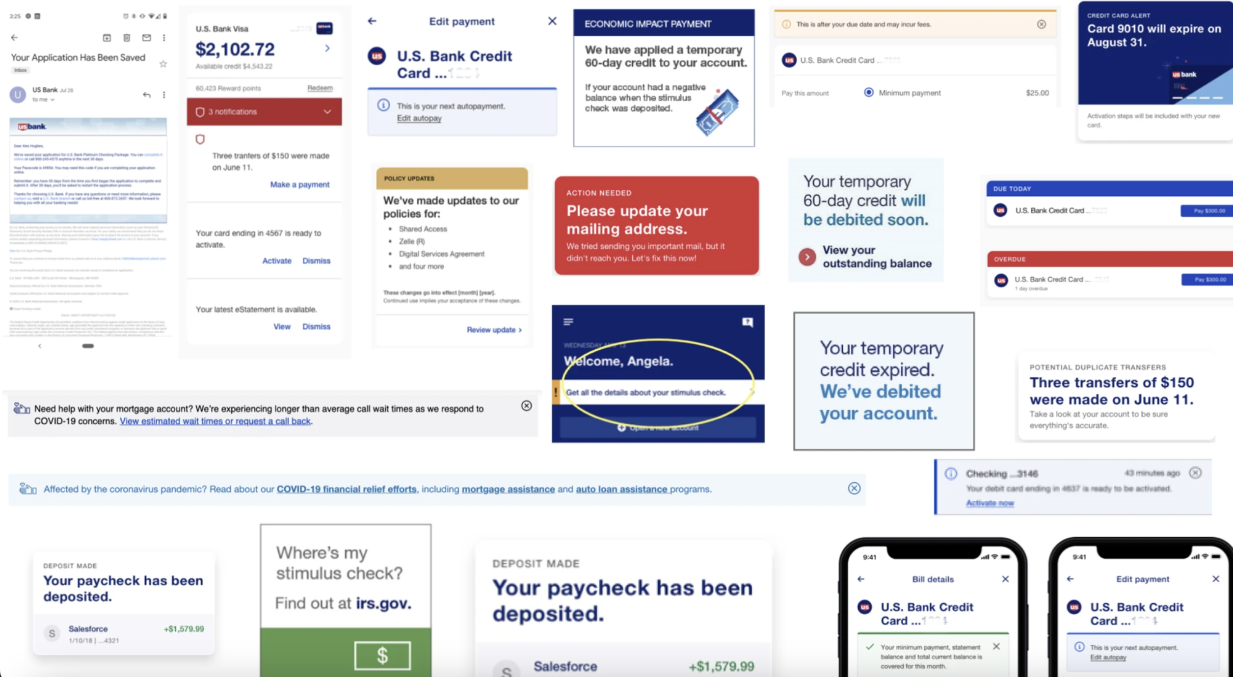
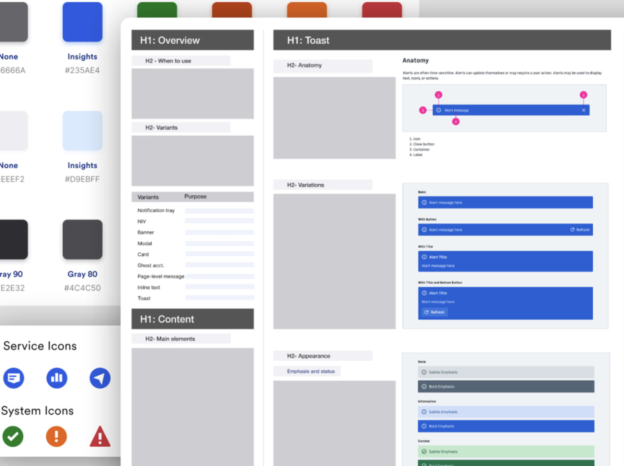
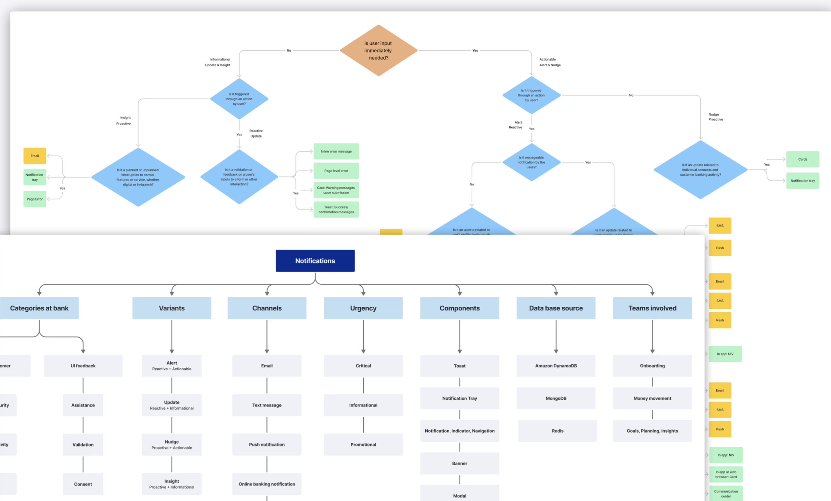
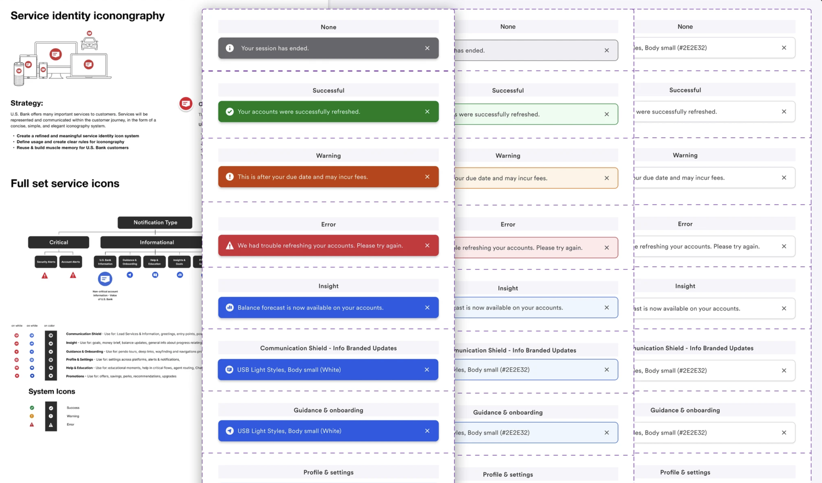
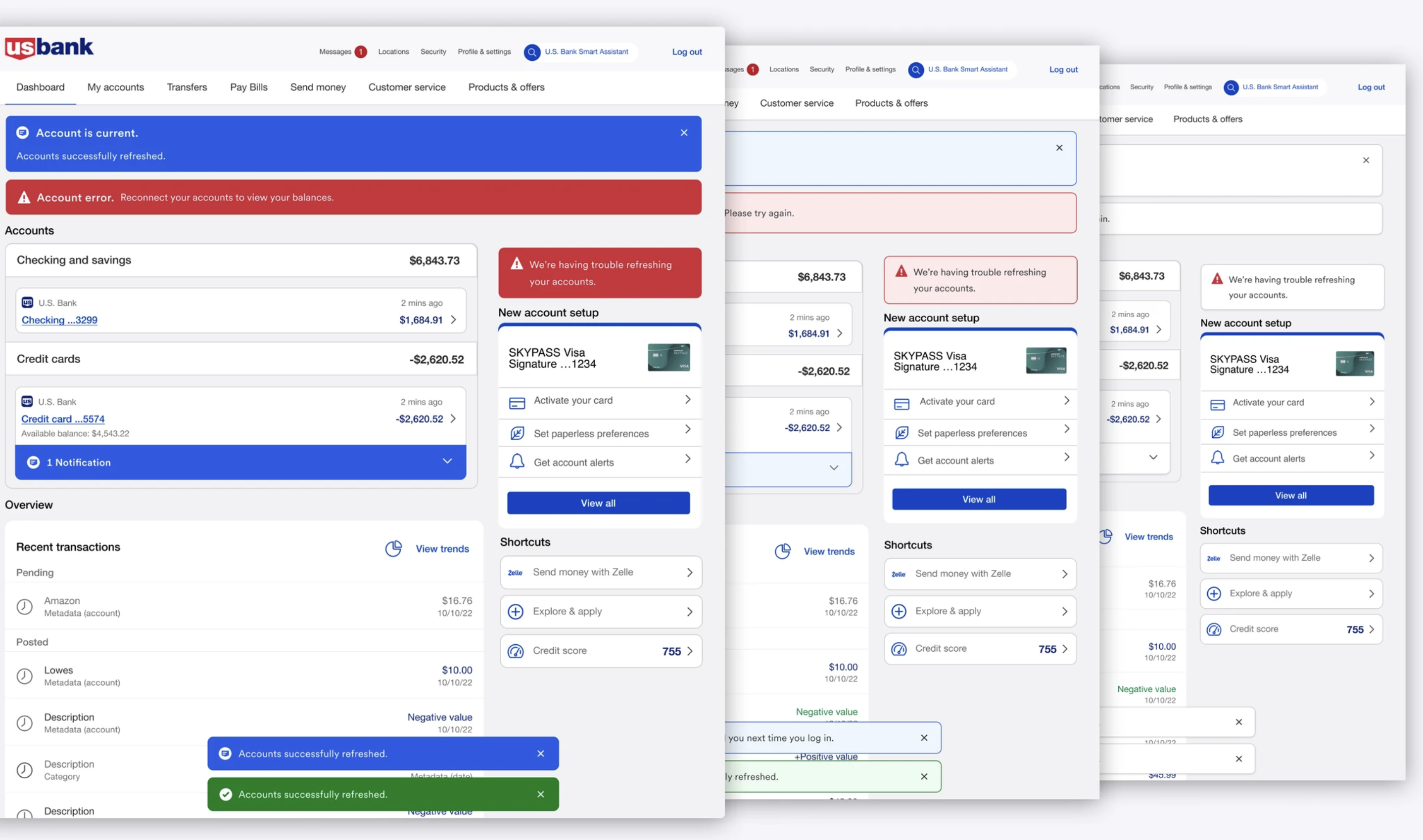
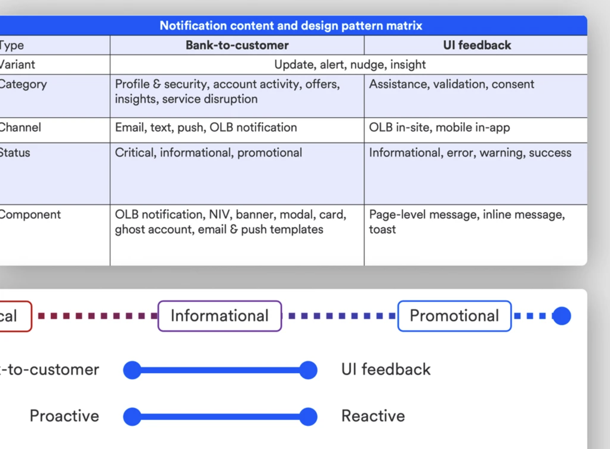
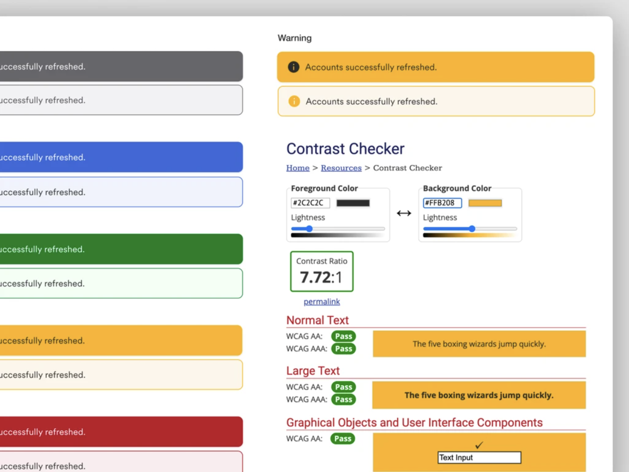
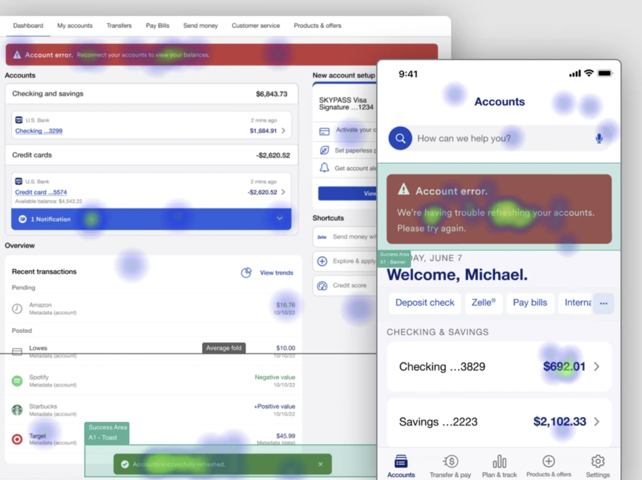
Enterprise Design System
The organization faced significant challenges in its notification system due to the absence of a centralized design approach. This led to inconsistencies in visual elements, fragmented processes, confusion over terminology, independent notification creation, and a lack of clear criteria for channel and component selection. The Alerts and Notifications team is committed to addressing these issues by developing a comprehensive solution that ensures a more consistent, efficient, and user-friendly notification system across all platforms.

The Challenge
The notification system faces several challenges due to the absence of a centralized design framework. Various teams create notifications across multiple channels including email, text, push, and in-app resulting in inconsistent visual designs, icons, and colors that contribute to a fragmented user experience. Additionally, the lack of standardized terminology has led to confusion, as different teams independently develop notifications without coordination or clear guidelines. This has resulted in redundant notifications and limited control over channel selection. The Alerts and Notifications team is uniquely positioned to resolve these issues by establishing a unified system that enhances consistency, clarity, and the overall user experience across all notifications.

The overview
Users & Audience
The alerts and notifications design system I developed is poised to benefit over 1,000 designers and developers across 50 micro teams, driving greater design consistency, streamlined decision-making, and improved cross-team collaboration.
Moreover, this initiative is expected to enhance the experience of over 11 million digitally active users, ensuring a unified and cohesive interface across all banking products and platforms.

My Role
As the UX Lead on this project, I drove the high-level strategy and taxonomy for our alerts and notifications design system. From designing new icons to selecting colors aligned with the organization’s design system, I meticulously managed every detail to ensure the visual and functional consistency.
My role also involved close collaboration with a diverse team, including interaction designer, content strategists, researchers, design system managers, branding strategists, accessibility consultants, and front-end developers. Together, we took a holistic approach to seamlessly integrating design excellence with user-centric functionality.

The Process
Holistic approach to taxonomy, content, and design strategy

Proposed components, color schemes, and iconography
In collaboration with my visual designer, we conducted a competitive analysis and proposed components for three key notification categories in online banking and the mobile app. We introduced light, medium, and dark color schemes align with the organization’s updated branding, enhancing visual consistency. Additionally, we refined iconography to improve visibility and establish clear priority indicators.
These designs were applied to validate the newly established guidelines, ensuring seamless integration into the design system for a cohesive and consistent user experience across all platforms.

Notification placement strategy, zone optimization, and user testing

The impact
Driving Cohesion

Enhancing accessibility
We enhanced accessibility in the design system by prioritizing color contrast and user testing:
- Ensured notification colors and font sizes comply with A11Y standards.
- Adjusted red and green notifications to be distinguishable for colorblind users.
- Conducted usability testing with colorblind participants to validate accessibility.
- Improved toast notifications by repositioning them to the top for greater visibility.
These efforts created a more inclusive experience, ensuring accessibility for all users.

Creating a More Intuitive & Accessible Experience

Reflections
Want the inside scoop?
Curious about the process and challenges behind this project?
I’d be happy to share more, feel free to connect!