Developer Portal
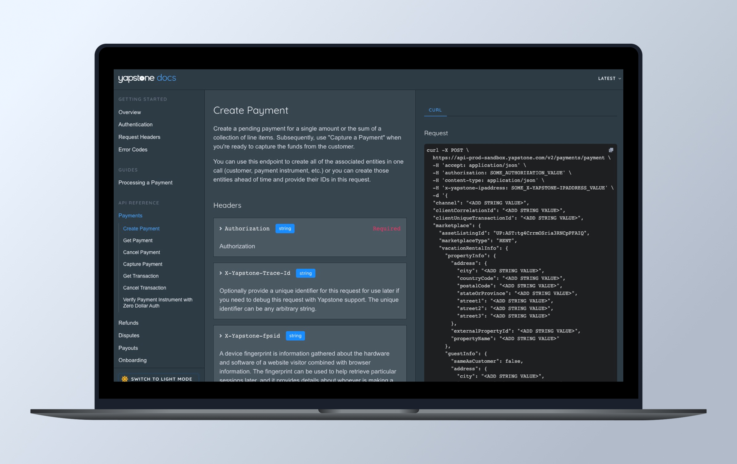
The Yapstone Developer Portal was designed to be a comprehensive, one-stop resource for all YapStone documentation. While distinct from the API Platform, it serves as a critical reference point for partners integrating with YapStone APIs, ensuring a seamless and efficient development experience.

Overview
My Role
Results
The Challenge
Pain points
Incomplete Information & Limited Coverage: The documentation only details happy paths, leaving edge cases unaddressed. Not all languages are supported, payloads cannot be tested, and versioning is nonexistent.
Delayed Value Demonstration: Without test API keys, clients face long wait times before experiencing the platform’s value.
Lack of Clarity & Consistency: Discrepancies between documentation and actual code create confusion. While internally understood, the documentation is not effectively communicated to clients, leading them to rely on direct support from Yapsters instead of self-service resources.
Inefficient Issue Reporting: Issues are flagged across multiple channels—Zendesk, emails, JIRA tickets, Customer Service reports, and direct Slack conversations with engineers—making tracking and resolution inconsistent.
Cumbersome Documentation Updates: The process for updating API documentation is slow and inefficient, delaying critical improvements and causing friction for both internal teams and external users.
Our primary objective is to make YapStone an exciting and compelling choice for developers by ensuring a seamless and efficient integration experience.
Generate Excitement: Developers should explore YapStone’s capabilities and feel eager to work with our platform.
Accelerate Integration: The faster developers complete their integration, the sooner they can start processing transactions—and the sooner YapStone benefits.
Encourage Advocacy: We want developers to not only recommend YapStone to peers but also bring us along to their future companies.
Make It Enjoyable: The integration experience should be smooth, intuitive, and even fun.
Everything we build should be designed with the developer experience in mind—keeping it as frictionless and efficient as possible. Developers have a long list of tasks, and YapStone is just one piece of their workflow. Our job is to help them complete their integration quickly so they can move on to the next challenge.
We recognize that external developers are not here to become payment experts. They don’t need deep knowledge of onboarding, underwriting, or payment rail mechanics—they simply need clear, concise instructions on how to integrate and move money efficiently. Our documentation should focus on practical implementation, avoiding unnecessary complexity and jargon.
Information Architecture
Card Sorting
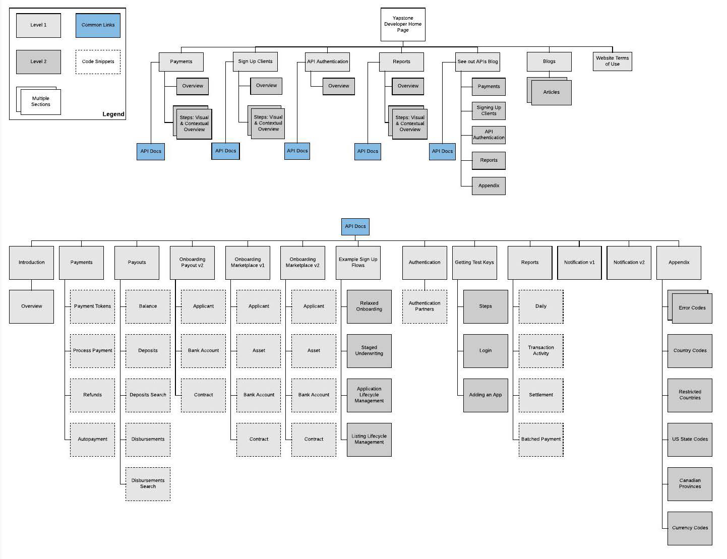
To refine and guide the product vision, I developed a high-level list of site features, prioritizing them based on supporting research to establish a clear execution roadmap.
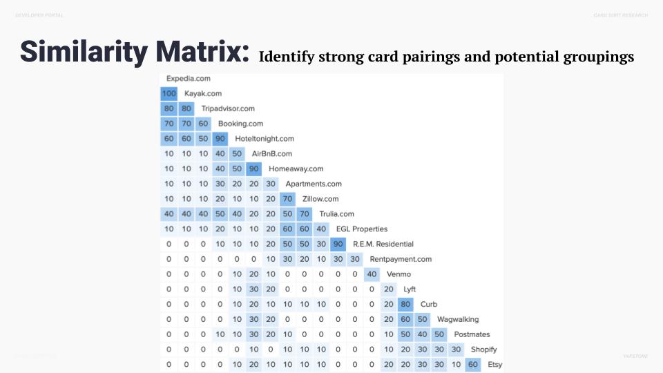
To understand how users naturally group concepts and categories, I conducted an open card sort. This approach provided valuable insights into user mental models, helping to structure the information architecture in a way that aligns with their expectations and improves overall usability.


The Solution
Topic-Based Authoring – Structure content around specific topics to improve readability and discoverability.
Clear Explanation of Every Call and Parameter – Provide in-depth details on API calls, including their functionality and intended use.
Comprehensive Details – Define each call, parameter, and possible values, covering data types, formatting, rules, and required fields.
Real-World Examples – Offer clear examples of API calls, including request breakdowns and sample responses for better understanding.
Sample Code Integration – Leverage eye-tracking research insights by incorporating well-placed example code that naturally captures developers’ attention, making documentation more actionable and efficient.
UI Design Strategy
General Page Layout
Overview – Provide a concise introduction and key takeaways.
Visuals – Incorporate diagrams, UI mockups, and workflows to enhance understanding.
Code Snippets – Include interactive and static code samples from sources like GitHub and CodeSandbox.
API Reference Links – Seamlessly connect product/feature overviews to relevant API documentation.
Enhanced Navigation & Accessibility
Contextual Linking – Bridge feature descriptions with API references for a cohesive developer experience.
Dynamic Table of Contents – Enable easy navigation across subpages with a well-structured TOC.
Version Control – Ensure clarity and consistency by maintaining and displaying versioned documentation.
With stakeholder alignment and a clear design strategy in place, we developed a comprehensive set of mid-fidelity wireframes to define the structure, features, and user flow for each page. Leveraging personas, use cases, goals, and flow diagrams, we created over 50 annotated wireframes that provided a strong foundation for an intuitive and seamless user experience. These wireframes detailed key interactions, ensuring users could efficiently navigate the platform and make informed decisions.
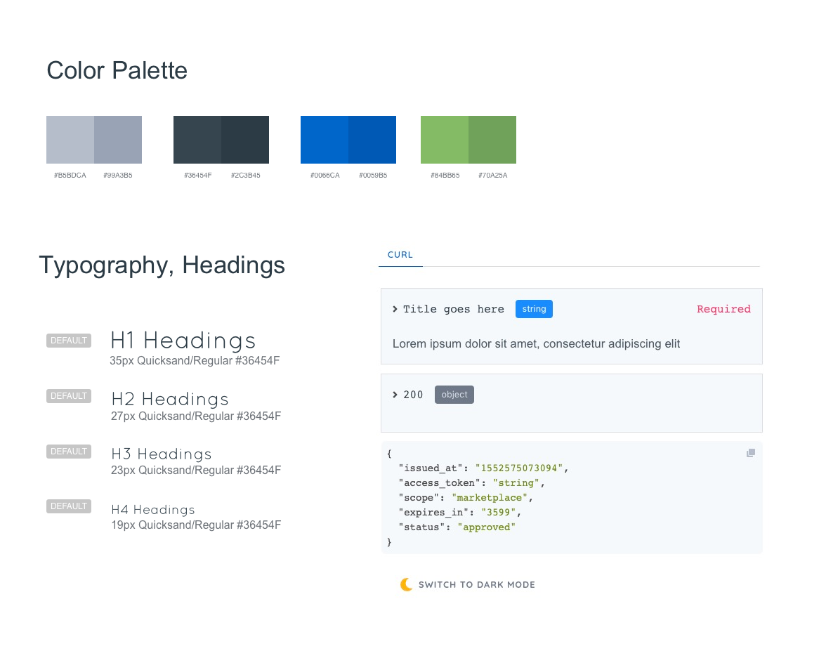
Building on this foundation, we transitioned into high-fidelity prototyping. Using the company’s style guide and an approved visual direction, we meticulously refined the UI, focusing on every detail to deliver a polished and engaging experience. Our team explored multiple design directions, ultimately landing on a clean, modern aesthetic that balanced simplicity with depth. The final design was intuitive, visually cohesive, and guided users effortlessly through the interface, enhancing both usability and brand storytelling.
Site Style Guide

Want the inside scoop?
Curious about the process and challenges behind this project?
I’d be happy to share more, feel free to connect!