Scalable Design System

Scalable Design System

Lead Designer | 2023 | Enterprise Design System

To ensure consistent design across multiple platforms, I developed the Smart Assistant Design Library—a centralized system that standardizes components for both native and online banking interfaces. The library tokenizes components, includes thorough documentation, and enables teams to quickly assemble and update designs with fewer errors. By streamlining the design process, it accelerates development and enhances overall UI consistency.

Introducing U.S. Bank Smart Assistant

Users & Audience

The alerts and notifications design system I developed is poised to benefit over 1,000 designers and developers across 50 micro teams, driving greater design consistency, streamlined decision-making, and improved cross-team collaboration.

Moreover, this initiative is expected to enhance the experience of over 11 million digitally active users, ensuring a unified and cohesive interface across all banking products and platforms.

The overview

Users & Audience

The Smart Assistant Design Library is used by UX teams, Smart Assistant partners, developers, and non-designers. It standardizes components and naming conventions, streamlining the design-to-development process. Developers benefit from tokenized elements, while non-designers can easily leverage pre-built screens to create flows—ensuring consistency across all teams.


My Role

As the creator and lead of the Smart Assistant Design Library, I defined its high-level strategy and oversaw every detail down to the pixel. I guided two designers to ensure alignment and professional growth while serving as the primary contact for internal teams and external partners. I managed new requests, enforced consistent use of the library, and drove continuous improvements to meet stakeholder needs.


The context and challenges

Initial challenges in developing the Smart Assistant for native platforms

When we first launched the Smart Assistant at U.S. Bank, it was developed exclusively for native platforms. During this phase, multiple teams were independently creating components for the Smart Assistant without a centralized system, leading to design inconsistencies and inefficiencies.


As we observed the development process, it became clear that many components shared similar patterns and styles, despite being built separately. These recurring design elements highlighted the need for a unified approach to streamline workflows, ensure consistency, and improve efficiency across all teams.

The design system

Introducing Smart Components: a scalable solution for consistency

To address repeated components and inconsistencies, we introduced Smart Components—a modular, reusable system designed for flexibility and efficiency. These components allow designers and developers to toggle layers on and off, creating new elements without starting from scratch while maintaining consistency across platforms such as iOS, Android, and the web.


By aligning with developers and tokenizing the components, we standardized naming conventions, reduced development time, and ensured seamless integration. Comprehensive documentation supports the system, enabling smooth collaboration and onboarding.


Smart Components now form the foundation of the Smart Assistant Design Library, providing scalable, cross-platform consistency and enhancing the overall design and development process.

Expanded the Smart Components to Cross-Platform Experience

After launching the Smart Assistant on native platforms, we expanded its capabilities to online banking. We applied the same modular system from native platforms to the online experience, using React to implement the atoms, molecules, and organisms that formed the core of the cross-platform design. This approach streamlined development and ensured that the Smart Assistant maintained a unified, consistent user experience across both native and web environments.

Core screens

With the Smart Components system in place across all platforms, we created customizable templates and screens for both native and responsive web. These core screens and flows are ready for teams to grab and build on for various competencies. By using toggles within components, teams can turn elements on or off, making them flexible and adaptable. Each screen is structured like a template for Smart Assistant responses, making it seamless to build new features as long as everything is annotated with the correct naming conventions and content. This approach ensures efficiency and consistency in development across platforms.


Figma design library and component families

The Smart Assistant initially launched on native platforms and later expanded to online banking. While developing the first few competencies, we noticed that many components were being repeated and followed consistent patterns. By collaborating closely with the development team, we identified these patterns and found an effective way to reduce development effort while maintaining consistency across the platform.

The impact

Consistency Across Platforms

Smart Components have unified the user experience across iOS, Android, and web platforms, ensuring a consistent look and feel. This approach eliminates discrepancies between platforms, reinforces brand integrity, and provides users with a seamless, predictable experience regardless of the device they use.

Increased Development Efficiency

By leveraging reusable Smart Components, the development team has significantly improved productivity and streamlined onboarding. The SmartComponentModel allows developers to easily define components by specifying inputs like type, leadingText, and trailingText, with type determining styles such as rowLarge or headerMain. These components ensure consistency, reduce feature implementation time, and automatically apply updates across platforms, supporting faster deployments and the bank’s strategic goals.

Enhanced Accessibility and Scalability

Smart components prioritize accessibility by adhering to A11Y standards, ensuring inclusivity for all users. The code’s accessibilityLabel feature allows screen readers to convey key details, improving usability for visually impaired users. This scalable framework supports the bank’s digital transformation, enhancing both mobile and web experiences, boosting user satisfaction, and strengthening customer loyalty.


Reflections

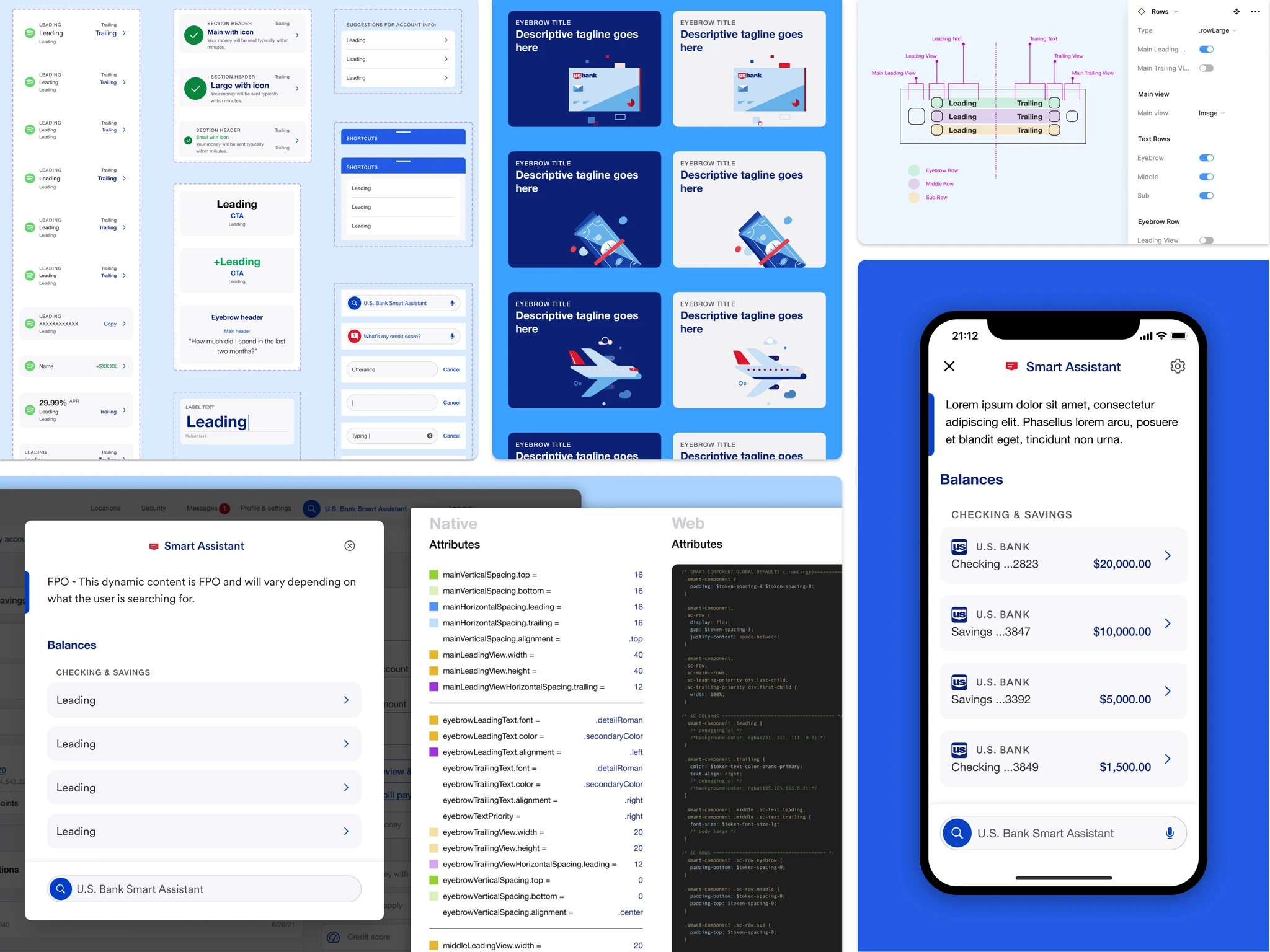
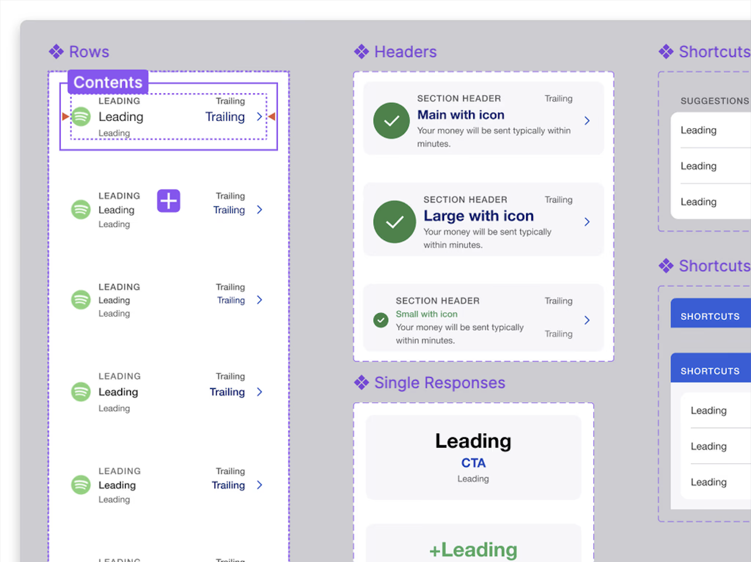
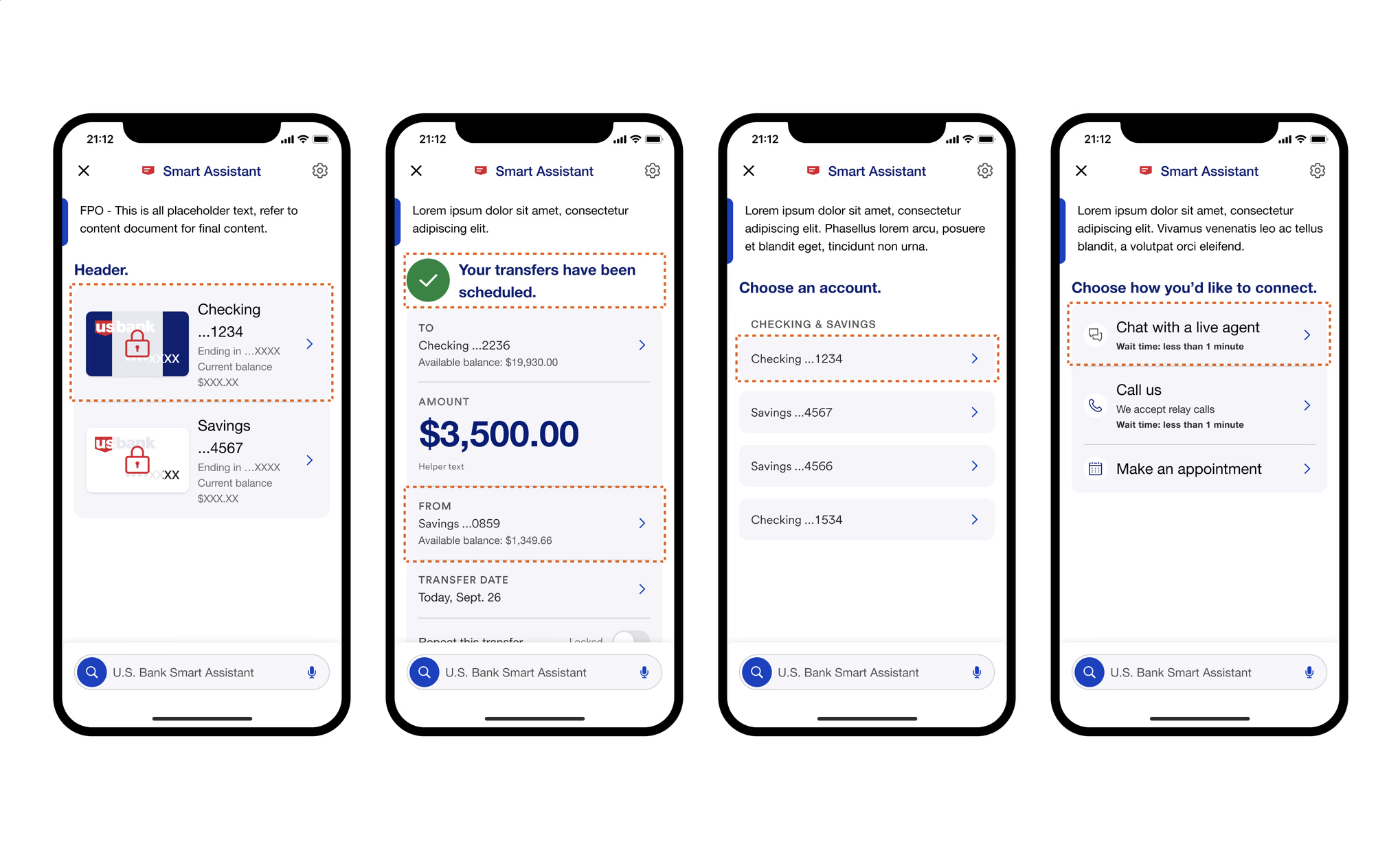
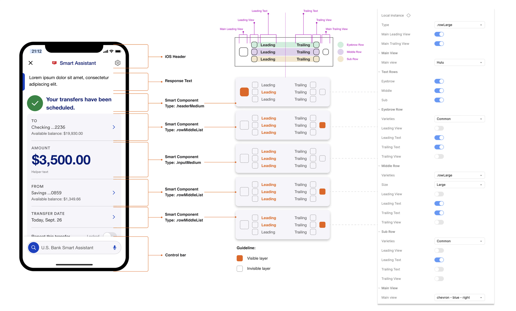
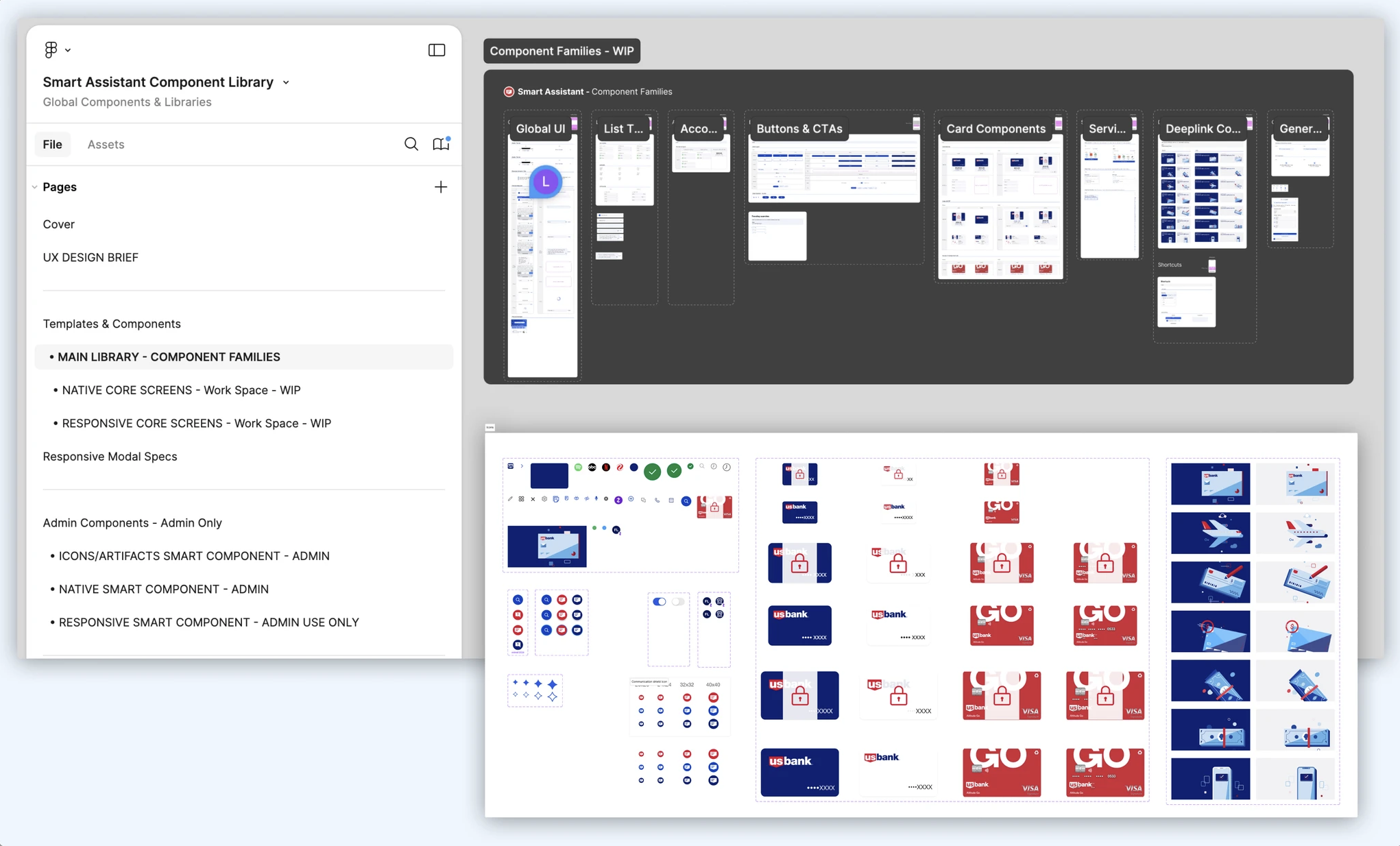
Developing the Smart Assistant Design Library and Smart Components reinforced the importance of collaboration, consistency, and scalability in design systems. By observing patterns, aligning closely with developers, and iterating on reusable components, we were able to streamline workflows, reduce errors, and deliver a cohesive cross-platform experience. This project highlighted how thoughtful design infrastructure can accelerate development, support team efficiency, and ultimately enhance the user experience.

Want the inside scoop?

Curious about the process and challenges behind this project?
I’d be happy to share more, feel free to connect!